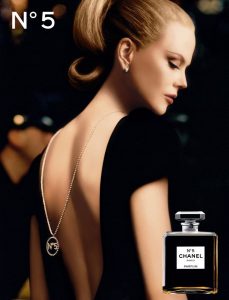
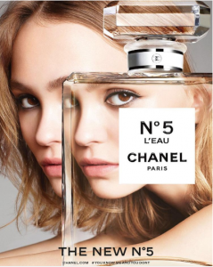
In this blog post, I will conduct a multimodal analysis of two Chanel fragrance advertisements. The purpose of multimodal analysis is to examine how different modes work together to create meaning (Jones 2012). The advertisements selected can be found online and in popular fashion magazines such as Glamour magazine. Figure 1 Shows an advertisement for Chanel N°5, which is aimed at a mature female audience. Whereas, Figure 2 shows an advertisement for Chanel N°5 L’EAU, which is aimed at a young female audience.
In Figure 1, black is the prominent colour. The associative value of black is sophistication, elegance and authority. The designer draws on these associations to illustrate the timelessness of the product, and to convey the mysteriousness and elegance that defines the Chanel woman (Kress & Van Leeuwen 2006). The dark background creates a mysterious, fantasy-like setting that entices the viewer and suspends their realism. The direct value of this is that it forces the viewer to believe that by purchasing the perfume, they can become the ideal woman portrayed in the advertisement (Kress & Van Leeuwen 2006). Dissimilarly, grey is used as the background colour in Figure 2. The associative value of grey is depression and coldness (Kress and Van Leeuwen 2006). Grey is used to mourn the old image of Chanel and to symbolise the new rebellious and independent attitude that represents the modern woman. The direct value of grey is that it forces the viewer to be reflective and to rethink their perceptions of the Chanel image (Kress & Van Leeuwen 2006). Moreover, the designer’s choice to not use overly saturated images in Figure 2. is intentional. The dull colours create a more realistic image that the viewer can identify with in comparison to the saturated image in Figure 1. (Jones 2012).
The mode of font is also used to construct meaning. Within both advertisements, the same capitalised bold font is used to signify elegance and prestige. As Jones (2012 cited Kress and Van Leeuwen 2006) suggests, Halliday’s (1994) metafuctions can be applied to multimodal analysis. Therefore, with reference to the interpersonal metafunction, the bold capitalised font that appears in both advertisements is used to grab the reader’s attention and highlight that this information is important (i.e. the name of the brand and the product). With reference to the textual metafunction, the designer of Figure 1 creates a coherent advertisement through their use of the same font throughout the advert. This is done to reinforce Chanel’s traditional style. However, the designer of the Figure 2 uses a different font that is slightly wider and rounder, which reads “THE NEW N°5”. This contrasts subtly to the bold font used throughout Figure 1. Through their font choice, the designer intends to reveal that “THE NEW N°5” is a delicate twist on the legacy already established by the original N°5 perfume.
Both designers use gaze to create a relationship with the viewer, i.e. interpersonal metafunction (Jones 2012 cited Halliday 1994). The woman in Figure 1 is looking away from the viewer— casting the viewer as the ‘voyeur’ (Jones 2012: 121). The designer intends to reinforce the idea that the Chanel woman is someone to be watched: an object of desire. Whereas, in Figure 2, the young woman gazes directly at the viewer through the bottle, creating a more intimate relationship with the viewer. This is deliberate as the designer of Figure 2 intends to make the Chanel woman more accessible to the viewer to encourage a new generation of women to purchase the perfume.
The mode of layout is employed by both designers. In Figure 1, the woman is placed at the top of the image in the ‘ideal’. Kress and Van Leeuwen (2006) claim that the ‘ideal’ presents the desired outcome of using the product, which in this instance is becoming a woman desired and watched by others. The bottle at the bottom of the image is placed in the ‘real’ (Kress and Van Leeuwen 2006). However, the designer does not include any further details about the product that can usually be found in the ‘real’. Jones (2012) suggests that one should focus on information excluded from the image also. Therefore, the fact that both advertisements exclude the price of the product demonstrates the power of the Chanel brand because this information is irrelevant to the effectiveness of their advertisements (Van Leeuwen 2008 cited Berger 1972). Although the designer of Figure 2 does not include the price of the product in the ‘real’, the designer does include where the product can be purchased, “CHANEL.COM”. The designer also includes a slogan as a hashtag in the ‘real’ to create an online movement and promote the product further. These features are absent from Figure 1, which relies predominantly on images to create “dreams of glamour” (Van Leeuwen 2008: 136). Whereas, the designer of Figure 2 must provide further information because the product is new and deviates from Chanel’s typical image. The designer of Figure 2 does so using the mode of words with layout.
In conclusion, both designers use the modes of colour, layout and font to create meaning. Nevertheless, the way in which they exploit these modes differs drastically. The designer of Figure 2 uses these modes to appeal to a young female audience and the designer of Figure 1 appeals to a more mature female audience. Both designers are effective in shaping a narrative around their products that conveys their ideal version of the Chanel woman through their use of these modes. However, the designer of Figure 2 must rely on the mode of words much more than the designer of Figure 1 because the former product is new and not yet established in the market.
References
Chanel N°5 Advertising Campaign (2005) [online] available from <http://inside.chanel.com/en/no5/campaigns/2005_no5_kidman> [8 January 2019]
Chanel No.5 L’eau Perfume Campaign (2016) in Glamour [online] 17 August. available from <https://www.glamourmagazine.co.uk> [8 January 2019]
Jones, R. (2012) Discourse analysis: A resource book for students. New York: Routledge
Kress, G., & Van Leeuwen, T. (2006) Reading Images: The Grammar of Visual Design. London: Routledge
Van Leeuwen, T. (2008) Discourse and practice: New tools for critical discourse analysis. Oxford: Oxford University Press.